/ Work / BruinPlace

BruinPlace

BruinPlace is a digital housing platform built to help UCLA students find off-campus housing. I explored user flows and designed UI/UX aimed at increasing transparency and reducing friction in a high-stakes search process.

Role
Product Designer
Timeline
Jan–Mar 2026
Team
2 leads, 4 designers, 6 engineers
Tools
Figma, FigJam
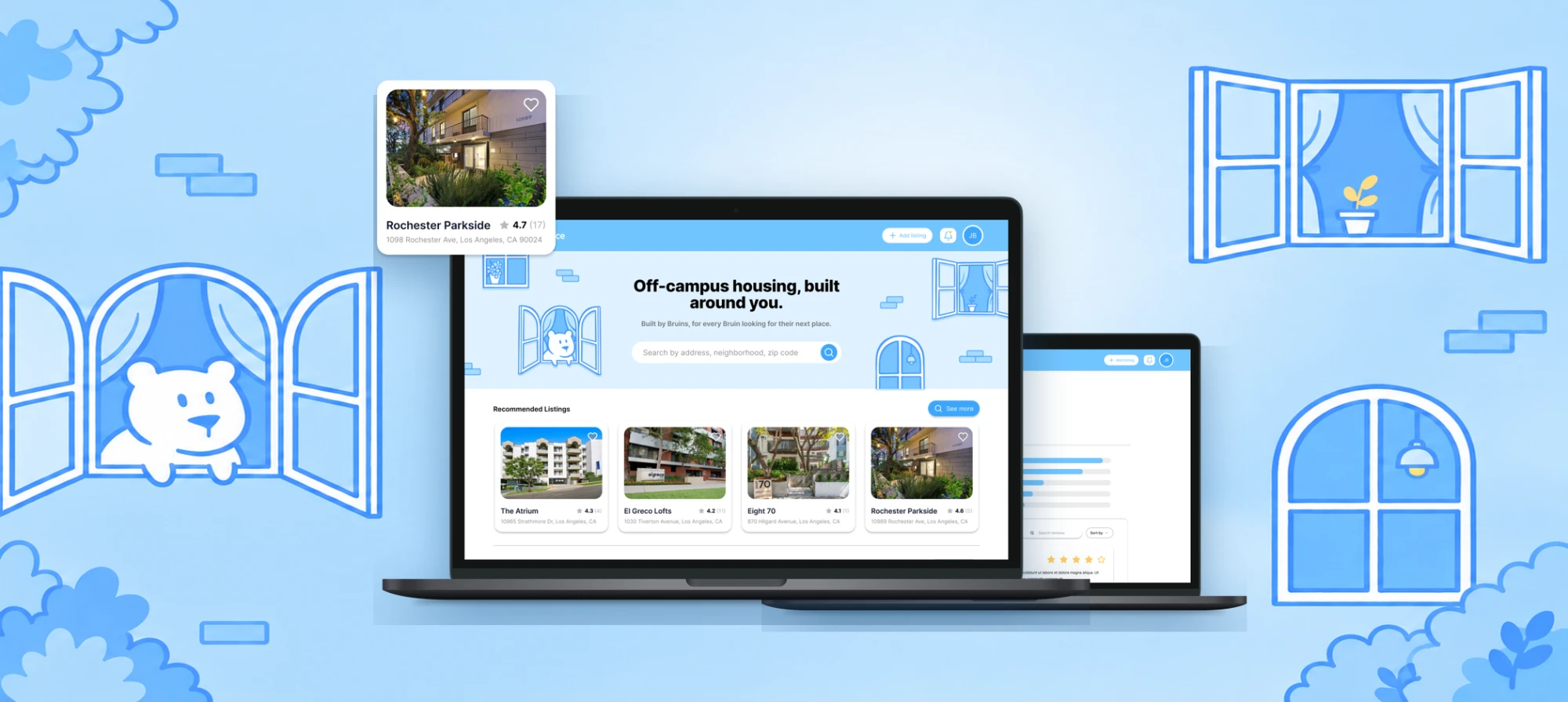
BruinPlace on two laptops, the home page reading “Off-campus housing, built around you.” with recommended listings, surrounded by illustrated windows and the bear mascot

Problem

After 30+ user interviews and 100+ survey responses, UCLA students had three main issues with the current off-campus housing search process:

Three issues: listing information doesn’t account for student needs; students need to navigate dozens of platforms to see all options; listings and posters lack trustworthiness

This is how students currently find housing:
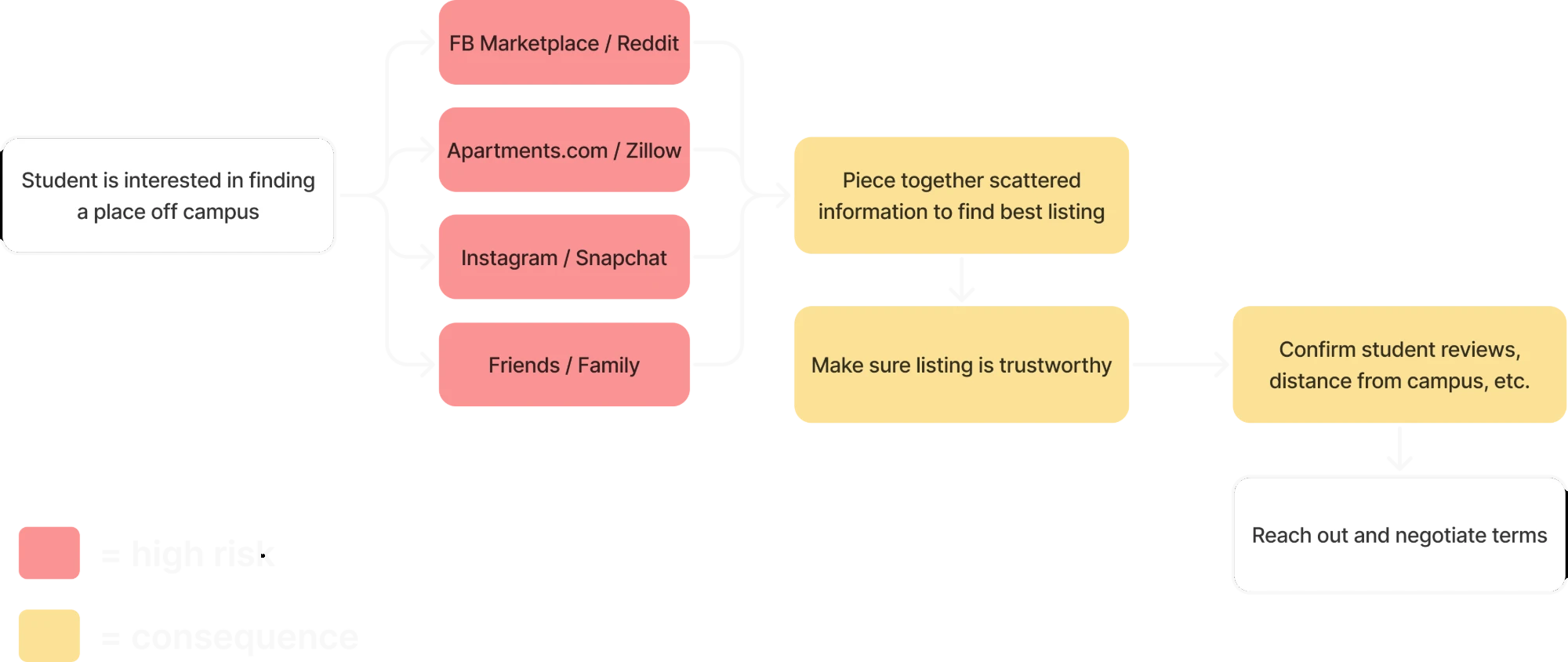
Current flow: a student searches FB Marketplace, Reddit, Apartments.com, Zillow, Instagram, Snapchat, and friends (high risk), then pieces together scattered information, checks trustworthiness, and confirms reviews and distance (consequences) before reaching out
Red marks high-risk sources; yellow marks the consequences students deal with.

Solution

A local housing marketplace that is centralized, personalized, and trustworthy.
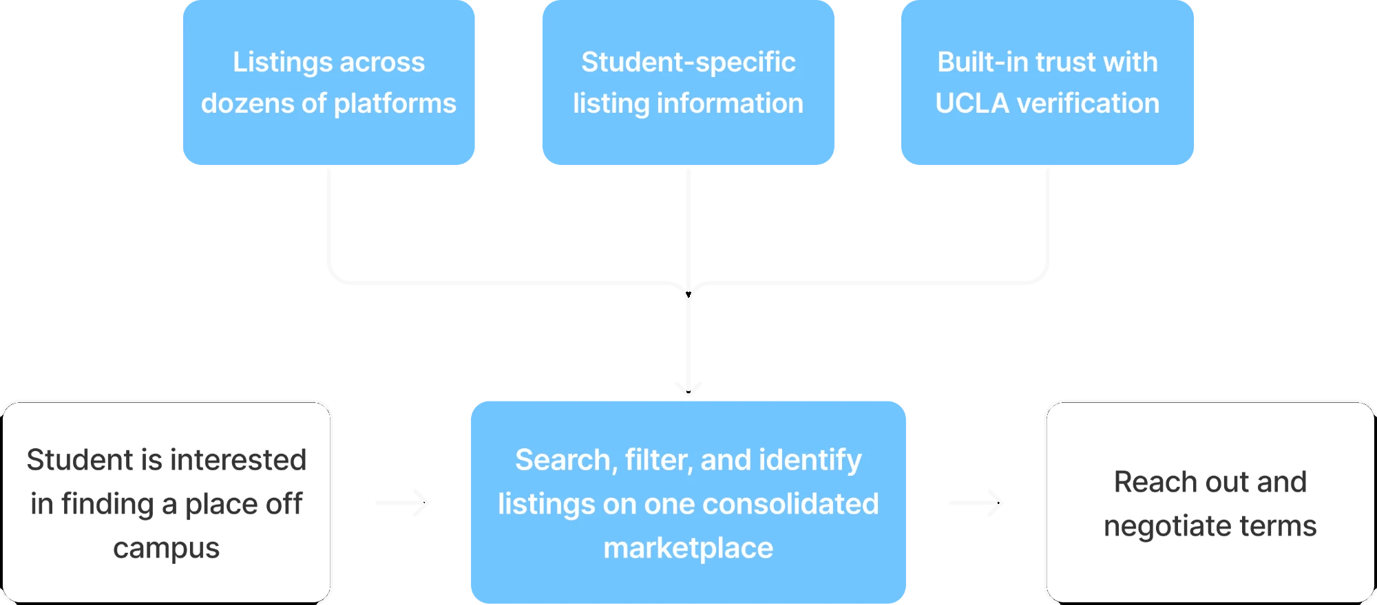
New flow: listings across dozens of platforms, student-specific listing information, and built-in trust with UCLA verification feed one consolidated marketplace where students search, filter, and identify listings before reaching out
The home page leads with search by address, neighborhood, or zip code, with recommended listings right below.
Split-screen search keeps listings and the map side by side. Sort, filter by beds, baths, and commute, and switch between buildings and units.
Building pages bring photos, amenities, open units, distance from campus by walk, bike, car, or bus, and student reviews into one place.
Profiles keep favorited buildings and units, your reviews, and settings together, with alerts when a saved listing opens up.

Process

We started by analysing the current options that students were using for their housing search.

Then, we mapped out different features on a user flow diagram.
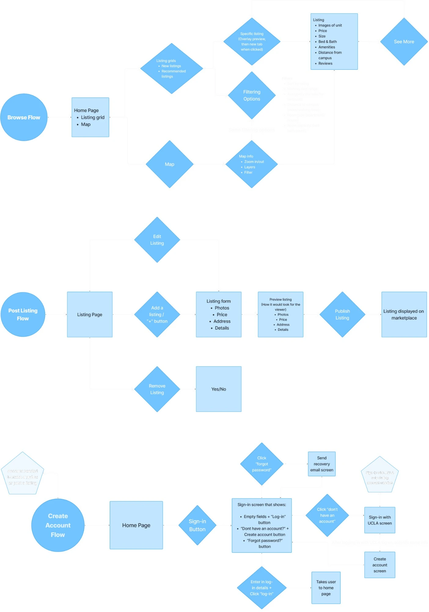
User flow diagrams for browsing (home page, listing grids, map, filters, listing details), posting a listing (listing form, preview, publish), and creating an account (sign-in, UCLA sign-in, account creation)
Browse, post listing, and create account flows.

With the user flow established, I explored multiple layouts for listing cards and detail pages. Each iteration focused on reducing visual clutter while improving hierarchy and scanability.
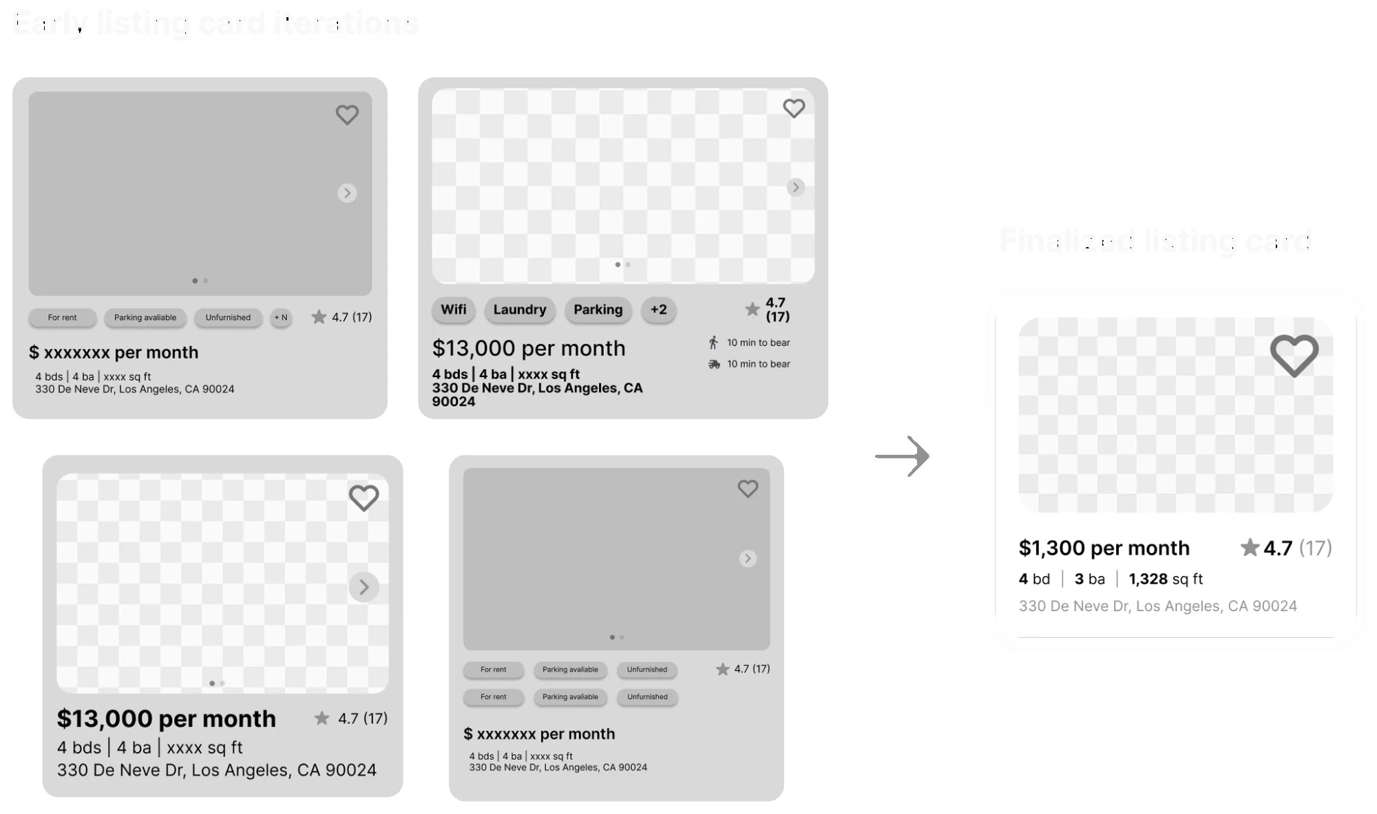
Four early grayscale listing card iterations with tags, prices, and ratings, next to the finalized card showing price, rating, beds, baths, square footage, and address
Early listing card iterations and the finalized card.

Our developers requested our team to use the ShadCN UI toolkit. Using the pre-made assets, we edited and customized them so it fit our branding and remained consistent across screens. I helped flesh out the button elements of our design system.
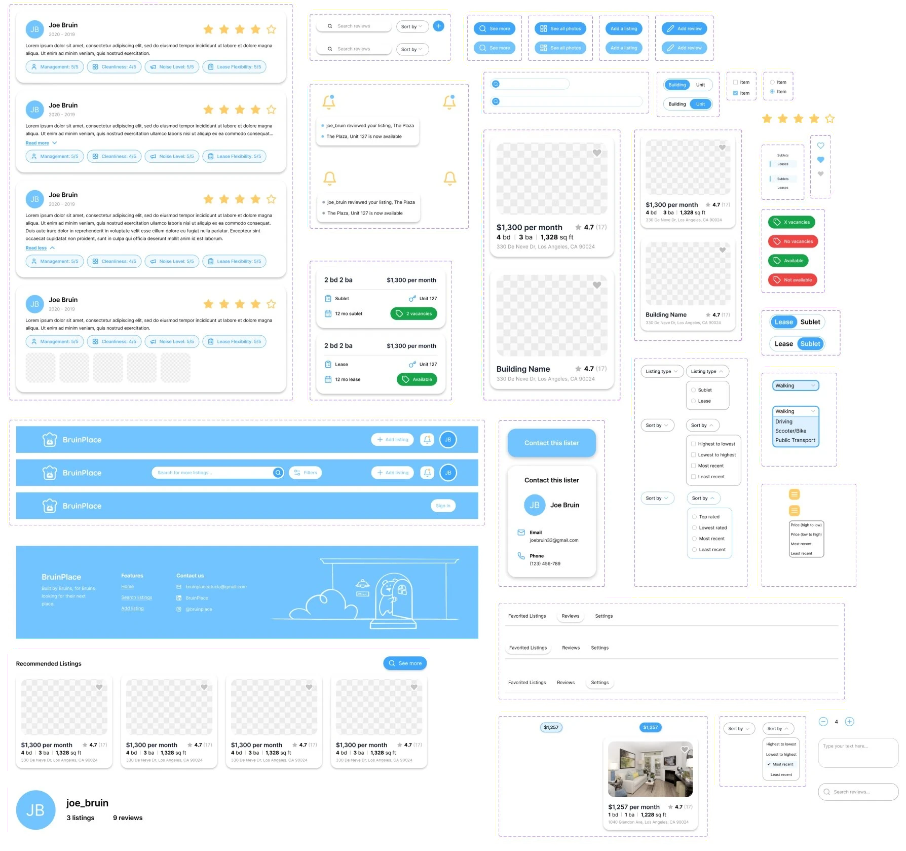
BruinPlace design system components: review cards, search and sort controls, buttons, notifications, unit cards, listing cards, toggles, dropdowns, headers, footer, and profile tabs
Components customized from ShadCN UI.

Testing

  • Split-screen in the header

    Students couldn’t find split-screen, so it moved into the header.

  • “Top rated”

    “Highest to lowest” read as price, not rating, so it was renamed “Top rated.”

  • Buildings and units

    Buildings and units blurred together, so a toggle now separates them.